 By Gabriel Andrei Villanueva
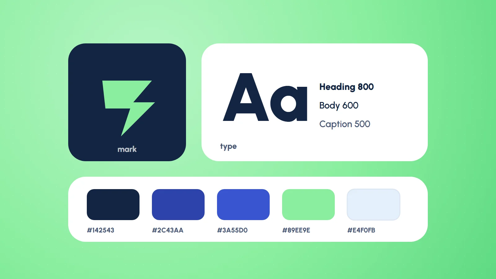
When people ask for a brand, they usually mean a logo. The logo matters, but it is the smallest part of the job. What makes a brand recognisable is consistency: the same colours, the same type, the same tone, used the same way on a shop sign, a Facebook post and a website. That consistency does not happen by accident. It comes from a small system of rules.
Why the logo is not enough
Picture a business with a lovely logo. Their posters use whatever font was open, their social posts use a different green every week, and the website was built from a template in yet another style. Each piece is fine on its own. Together they look like four different businesses. Customers do not see your logo file; they see everything around it.
Recognition comes from repetition. A brand is the set of choices you repeat.
The parts of the system
A useful brand identity for a small business does not need a hundred-page manual. It needs a handful of decisions, written down clearly:
- Logo, in all the shapes you need. A full version, a compact mark for small spaces and profile photos, and versions for light and dark backgrounds. Plus the clear space around it and the smallest size it can be used at.
- Colour. One or two main colours, a few supporting ones, and exact values for print and screen. Just as important: which colour is for text, which for buttons, which for backgrounds, so every new design does not reinvent it.
- Type. Usually one family for headings and one for body text, with the sizes and weights to use. Fewer fonts means faster websites and calmer layouts.
- Imagery. The kind of photos and illustrations that fit, and the kind that do not.
- Voice. How the brand talks. Friendly or formal, short or detailed. A few example sentences do more than a list of adjectives.
Design for where it actually lives
A brand gets tested in the real world, not in the presentation. Before I call an identity finished, I try it where it will run:
- The logo at 32 pixels as a browser tab icon, and on a tarpaulin across the street.
- The colours printed on cheap paper, and on a phone at low brightness.
- The type in a long paragraph, not just a headline.
- A social post made by someone who is not a designer, using only the guide.
That last test is the honest one. If someone on the team can make a decent post by following the rules, the system works.
From brand to website
This is where design and development meet, and where a brand system pays for itself. When I build a site, the brand’s colours and type become design tokens: named values used everywhere in the code. Buttons, headings, cards and forms all draw from the same small set. Change the primary colour once and the whole site follows. The website stops being a separate design project and becomes the brand, applied.
The same thinking runs through UI design. A clear system for spacing, type sizes and components is what lets a product grow without every new screen looking slightly different from the last.
Keep it small, then keep it
The best brand guides I have seen are short. Two or three pages that people actually open beat a thick document that sits in a folder. Start with the essentials above, use them for a few months, and add rules only when you notice the same question being asked twice.
If your business has a logo but not yet a system, that is the next step, and it is a smaller one than it sounds. See how I approach brand identity, or get in touch and we can start with what you already have.
Common questions
What is included in a brand identity?
A full logo and a compact mark for small spaces, versions for light and dark backgrounds, a colour palette with exact values and clear roles, one or two typefaces with sizes and weights, guidance on imagery, and a description of the brand’s voice.
What is the difference between a logo and a brand?
A logo is one mark. A brand is the consistent set of choices around it, repeated everywhere a customer sees you, which is what makes a business recognisable.
How long should a brand guide be?
Short. Two or three pages that people actually open beat a thick manual that sits in a folder. Add rules only when the same question keeps coming up.
How does a brand carry over to a website?
Its colours and type become design tokens, named values used everywhere in the code, so buttons, headings and forms all follow the brand and a change in one place updates the whole site.